Username   Password  
Remember   Register   |   Forgot your password?

Smirky!Ten

Smirky!Ten

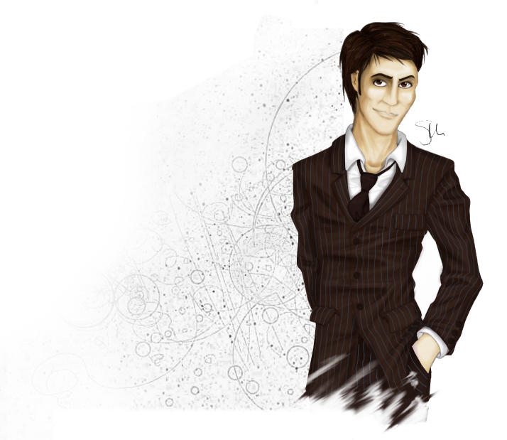
Smirky!Ten by spiritedchaos

Description

Description
spiritedchaos
To keep Torchwood!Master company, he'd get terribly bored on his own without anyone else to menace.

Background again pinched from the BBC site.

General Info

General Info
Ratings
None

Category Television » Dr. Who » Tenth Doctor
Date Submitted
Views 1350
Favorites... 2
Vote Score 2
Comments 7
Media Digital drawing or painting
Time Taken A week or so
Reference none

Comments

Comments (7)

You are not authorized to comment here. Your must be registered and logged in to comment

KalikaCortez on January 8, 2007, 3:57:56 PM

KalikaCortez on
KalikaCortezlike OMFG your digital colouring skills r so awesome!!! ~_^ this rocks!

spiritedchaos on January 30, 2007, 6:40:39 AM

spiritedchaos on
spiritedchaosThanks :D I'm still trying to get my digital colouring up to scratch and it's nice to know I am at least part way there.

AriaGunnir on January 28, 2007, 6:19:20 AM

AriaGunnir on
AriaGunnirHey there!  This isn't so bad for such a tough angle to draw, actually... I am not so sure it's actually the nose that's off...  What stands out just the tiniest bit to me is actually the right side of the face (from our point of view, not the character's actual right side): it looks slightly wider than the left side.  It could be that when you draw the face you keep sort of angling downward from the first side, instead of angling around and back up again, if that makes sense. It looks that way especially with the mouth... Here are a couple of links that might illustrate what the heck I'm talking about.   http://www.portrait-artist.org/face/structure.html  http://www.portrait-artist.org/face/nose.html  Great job, by the way!  Still in my faves!

spiritedchaos on January 30, 2007, 6:35:10 AM

spiritedchaos on
spiritedchaosI think you're right with what was wrong - I don't think anything on that face matches up properly! Thanks for the links & the concrit though - I'm always looking for stuff like that to read through :D.

AriaGunnir on January 30, 2007, 11:51:33 AM

AriaGunnir on
AriaGunnirI still really like it: I faved it.  There are a lot of movie stars with distinguishable facial characteristics: Barbara Streisand, Al Pacino, Juoaqim (sp?) Pheonix and a few others... I think it gives him character!

AngelusMortis on December 1, 2006, 7:52:17 AM

AngelusMortis on
AngelusMortisGood job on the coloring and the suit. The only part I don't like is the nose, probably because you drew one that looks like it's more suited for a face that's turned more than a face that's facing forward. I've noticed this in your other pieces as well.

spiritedchaos on December 1, 2006, 8:14:11 AM

spiritedchaos on
spiritedchaosThankyou for your comment :).

I've never actually done I proper study of how the face is put together (well up until now - I'm currently sat with a page full of noses in front of me, I've decided that's the next weak point in my stuff that I want to target). Usually as soon as I get to colouring the nose I just tend to make it up and given by that point I've spent so long colouring the bits I enjoy I usually end up doing just enough to make the picture look finished and leave it at that.

I'm pleased people are pointing it out though, my usual art betas have actually never said anything about it - it's always good to get a new perspective.