Night Life
Night Life
Night Life by terry_titanqueen

Description
Description
General Info
General Info
Ratings
Category Anime/Manga » - Original art » Characters (Female)
Date Submitted
Views 1231
Favorites... 1
Vote Score 0
Category Anime/Manga » - Original art » Characters (Female)
Date Submitted
Views 1231
Favorites... 1
Vote Score 0
Comments
8
Media Unspecified
Time Taken
Reference
Media Unspecified
Time Taken
Reference
Comments
You are not authorized to comment here. Your must be registered and logged in to comment
Cresent on May 6, 2006, 2:51:48 PM
Cresent on
AelitaStones021 on May 6, 2006, 2:22:48 PM
tvlover on March 3, 2006, 8:03:52 AM
tvlover on
ADDICT on January 30, 2006, 7:39:27 PM
ADDICT on
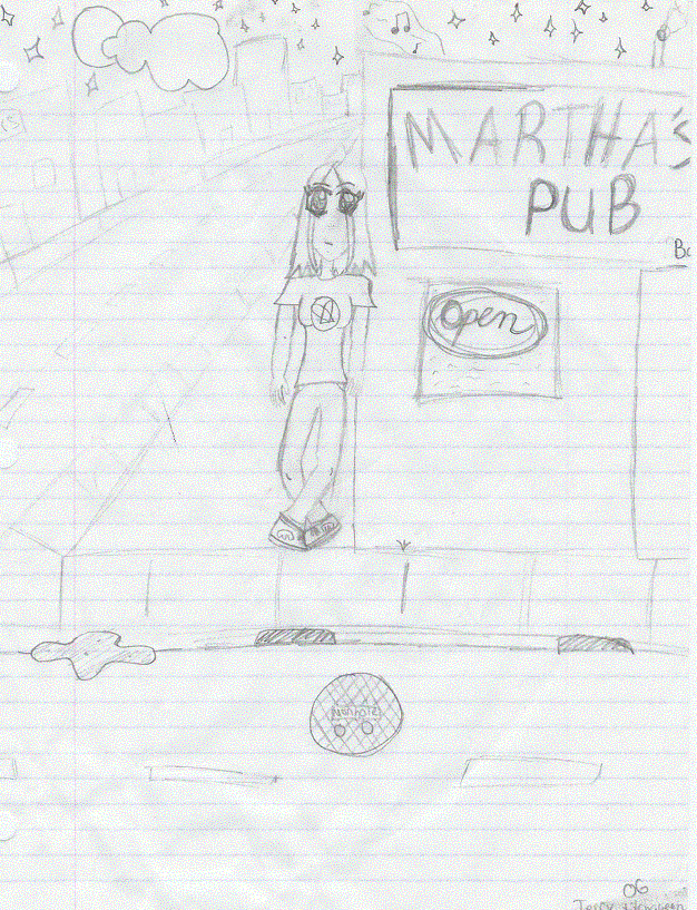
Well, first things first, you need to work a bit more on perspective. The picture looks kinda flat, you see.
Don't just draw the building in a simple square shape. Draw it as a cube, a box shape. How you should draw it, and from what point of view, (from above, from below) you decide.
Next is the sidewalk. See those six lines up front? When draing them from the front view, draw it like this:
/// *then a straight line in the middle of the focus of the pic,then* \\\. Slant it little by little as you go along the sides. The same thing can be applied to the lines on the streets. Draw them in longish parallelograms.
As for the manhole, draw it as an oblong shape. It will give more realism. Is that water in the gutter? Don't draw its lines so hard.
Well, for the girl, I'd say that in comparison to her hands and body, the head is too big and too long. The space between the eyes and mouth is a bit too much. And also, the lower legs are too short for the thighs, while the upper are a bit too short. They should be at waist level. Overall, the girl is too tall in comparison to the building.
Don't get me wrong though, I like how the background is so creative. I can't draw creative bacgrounds too much >.< . FYI, most of the backgrounds in my pics are just plain white @_@...
If you don't understand a thing, just tell me, and I'll be happy to explain some other time. I hope I helped ^_^! Bye now.
MageKnight007 on January 27, 2006, 2:58:01 AM
Mustard_Drunk on January 27, 2006, 1:25:25 AM
Goemon14th on January 27, 2006, 12:11:16 AM
Goemon14th on
Elen on January 26, 2006, 11:48:24 PM
Elen on

Work on that and you'll have a lot of improvment! ^-^