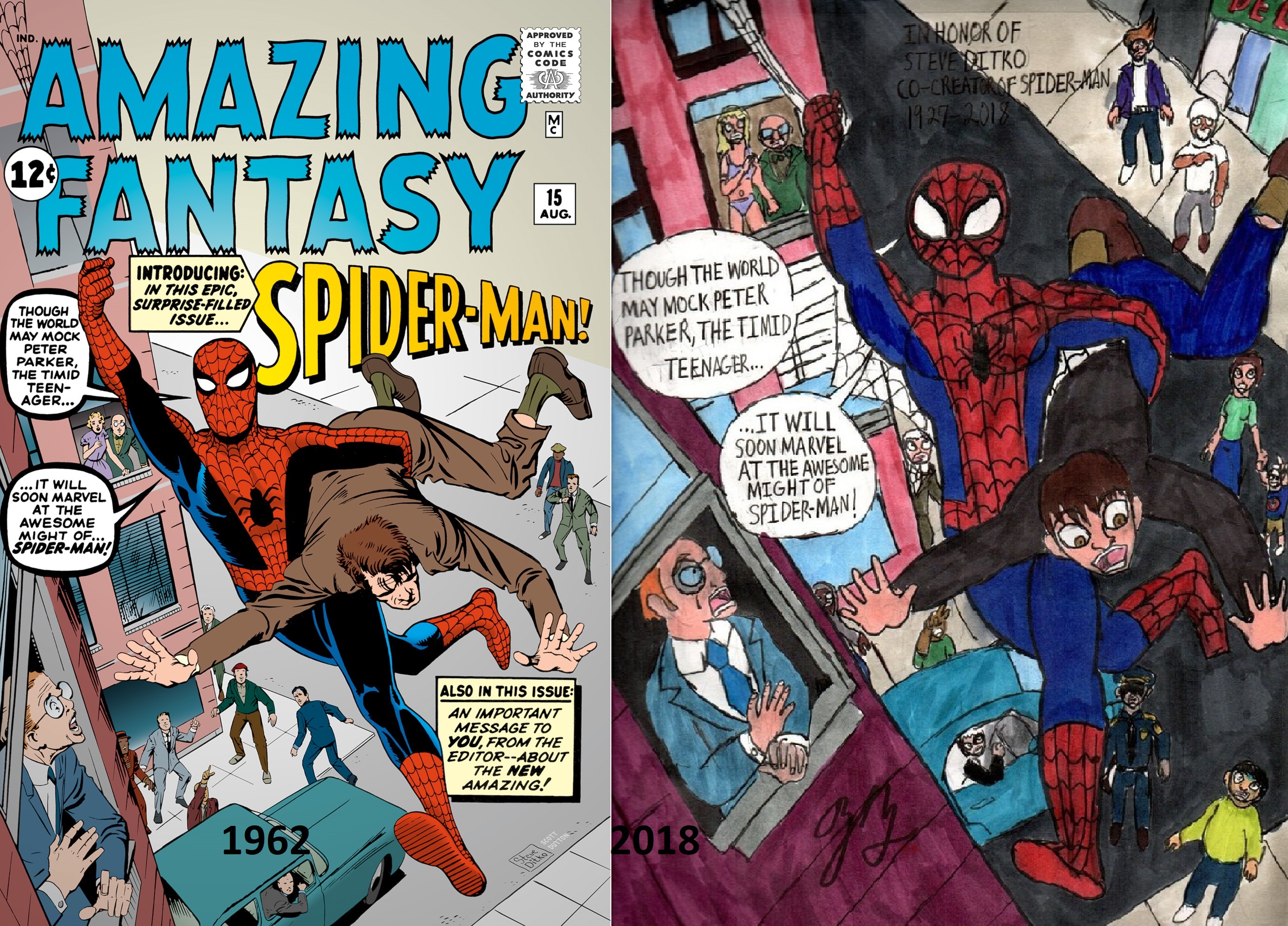
Spider-Man Steve Ditko Tribute
Spider-Man Steve Ditko Tribute
Spider-Man Steve Ditko Tribute by thezackburg

Description
Description
With the recent passing of Spider-Man Co-Creator Steve Ditko, I wanted to do a little tribute to him, with a homage of the original and I mean original cover for Amazing Fantasy #15, the first appearance of Spider-man Ditko was originally going to draw it but it went to Jack Kirby for the final decide. Overall I preferred the original over Kirby's. For those who don't know Steve Ditko was the co-creator of Spider-man. Basically he was the artist on Spider-man from 1963-1966 when he left Marvel. There is alot of beef that went between him and Stan Lee but I won't go into detail on it. Steve Ditko would go on to create or co create characters who while not as a popular as the webslinger, had their own cult following such as Dr. Strange, Blue Beetle, The Question, the Creeper and Squirrel Girl. If you haven't heard of Steve Ditko until now that's because the dude was basically a hermit. He hasn't appeared in the spotlight on his own free will and hasn't given an interview since the late 1960s and had some dare I say Far Right political beliefs, he didn't really talk much about it and I think that's why many fans seemed to admire him there was this sense of mystery to him. Anyway the man has passed on Jun 27th 2018 and I thought I would give him this tribute. Rest in Peace Steve
General Info
General Info
Ratings
Category Comics » - Marvel Comics » Spiderman
Date Submitted
Views 741
Favorites... 1
Vote Score 2
Category Comics » - Marvel Comics » Spiderman
Date Submitted
Views 741
Favorites... 1
Vote Score 2
Comments
2
Media Ink or markers
Time Taken
Reference
Media Ink or markers
Time Taken
Reference
Comments
You are not authorized to comment here. Your must be registered and logged in to comment
TeeJay87 on July 12, 2018, 12:23:27 AM
TeeJay87 on
thezackburg on July 24, 2018, 6:57:27 PM
thezackburg on

- the man carried by Spider-Man has better face expression in your painting;
- the background looks more convincing with people placed all around the street - Steve concentrated them in one line, yours look more like a real crowd would gather.
Well done !