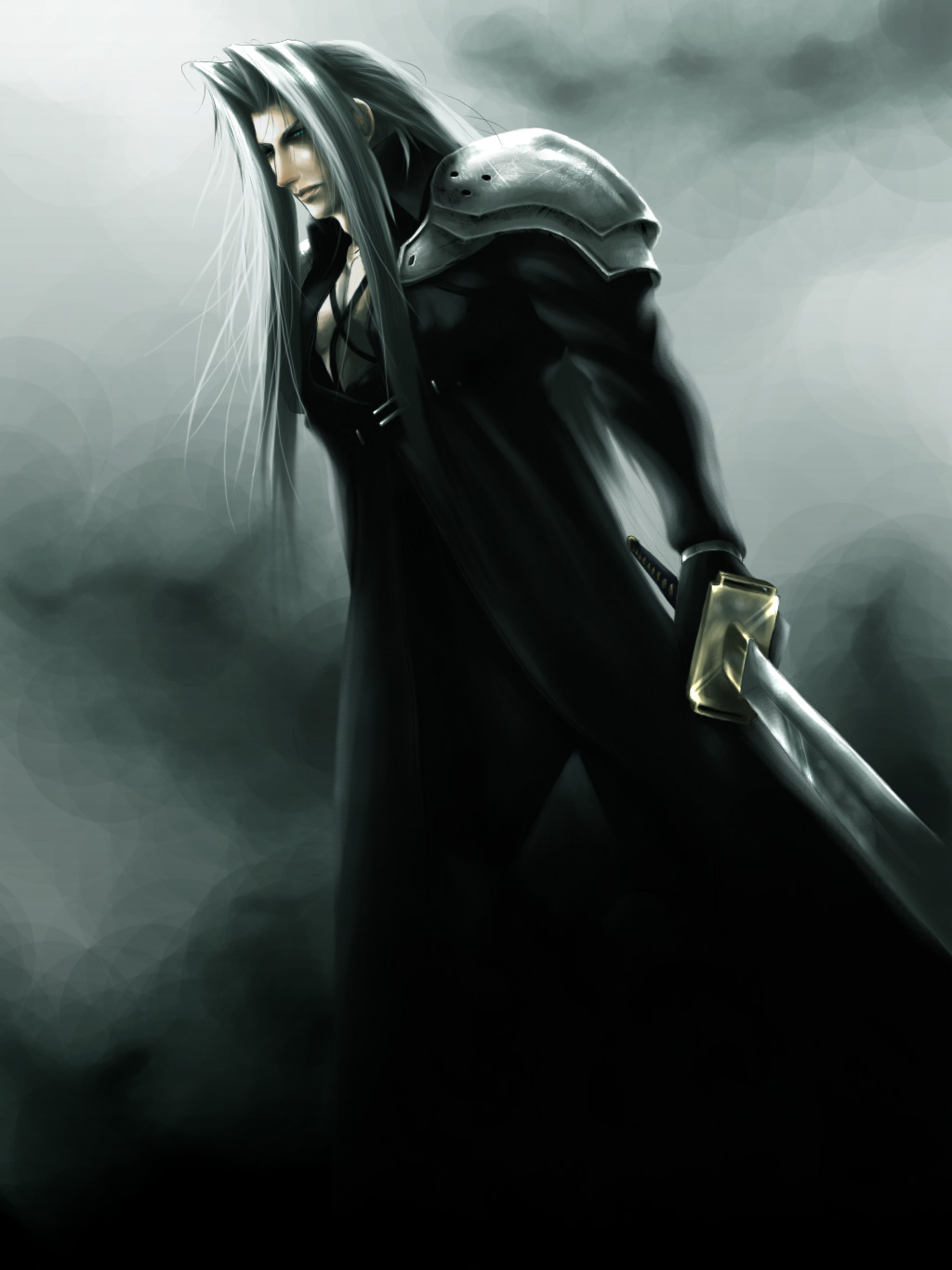
Give me the Pleasure of Taking it Away."
Give me the Pleasure of Taking it Away."
Give me the Pleasure of Taking it Away." by AngelusMortis

Description
Description
If you're seeing a whole load of artwork all at once, it's because I've entered these pieces into a contest and couldn't submit them online without having people know I drew them. This is actually one of my favorite entries, not only because it's Sephiroth, but because of the angle and lighting. I think I learned quite a bit from it.
Unfortunately, it never placed. I was told it was because it lacked details.
Unfortunately, it never placed. I was told it was because it lacked details.
General Info
General Info
Ratings
Category Movies » Final Fantasy VII Advent Children
Date Submitted
Views 3756
Favorites... 49
Vote Score 16
Category Movies » Final Fantasy VII Advent Children
Date Submitted
Views 3756
Favorites... 49
Vote Score 16
Comments
27
Media Digital drawing or painting
Time Taken hours, and hours, and hours...
Reference
Media Digital drawing or painting
Time Taken hours, and hours, and hours...
Reference
Comments
You are not authorized to comment here. Your must be registered and logged in to comment
Aiffe on August 30, 2007, 8:08:08 PM
Aiffe on
Haku17 on August 26, 2007, 2:20:10 PM
Haku17 on
Tifa777 on August 10, 2007, 5:23:31 AM
Tifa777 on
mewmagic5 on June 26, 2007, 12:26:33 AM
mewmagic5 on
TheJinx on June 25, 2007, 2:47:46 AM
TheJinx on
Kes on June 24, 2007, 7:23:56 AM
Kes on
357 on June 23, 2007, 10:43:08 PM
357 on

If I were to nitpick anything in this picture, it would be the shape of the face. Lack of detail certainly doesn't come to mind. You have a great cinematic mood, here.