Turnaround
Turnaround
Turnaround by BAMFManiac

Description
Description
General Info
General Info
Ratings
Category Miscellaneous » Characters » Female
Date Submitted
Views 2237
Favorites... 4
Vote Score 0
Category Miscellaneous » Characters » Female
Date Submitted
Views 2237
Favorites... 4
Vote Score 0
Comments
14
Media Unspecified
Time Taken
Reference
Media Unspecified
Time Taken
Reference
Comments
You are not authorized to comment here. Your must be registered and logged in to comment
BAMFManiac on February 5, 2004, 12:37:30 PM
BAMFManiac on
Juli on February 4, 2004, 2:20:45 PM
Juli on
BAMFManiac on January 28, 2004, 4:24:12 AM
BAMFManiac on
Jyan on January 27, 2004, 5:03:56 PM
Jyan on
<br />
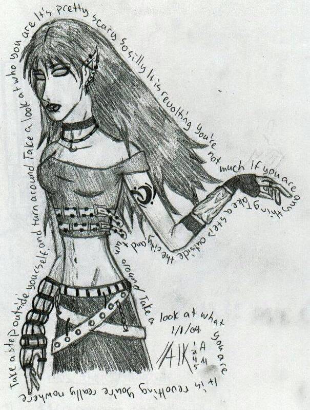
I love the feel of this one! The creative and fun cloths are great =) I'm not sure what is on her right hand (It is... clear ;)) but then again a bunch of stuff people wear serves no practical reason =) I guess that is why it is cool =) Neat tatoo design. I like how you added the belts to the shirt =) You could have just left it a "normal" shirt but instead you just added belts, brilliant! =D *Grin* You aligned the facial features verry well (pretty hard angle), but I think the nose is going down just a little too far. I like how the eyes are blank =) You did a great job on the hands, the lengths of the fingers are good and the shapes of them are consistant. The index finger does seem slightly long though... I think it is because they are just a little too long and the flesh connecting the thumb to the index finger isn't as far up (in these cases down and to the right) as it should be.<br />
Probably the best part I like about this pic is the words =) You kept them at a consistant distance away from the body at all times, which was important because it is pretty easy to notice the fluctuations. But they look cool because they are like an aura or something around her, I'm not quite sure why that is =)<br />
In this pic, like a few others, you also drew your character taller and thinner than they normally would. But that is ok if you want it like that because there are different styles. There is this one cartoon, I believe Kid Notoriouse, that draws their characters almost like stick figures ;) Lol heck! I've seen online comics with a full cast of potatoe characters =D So it is all up to you!<br />
<br />
Nice job though =)

<br />
lol um yea i have no official drawing tools (just an eraser, sharpener, and #2 pencil), so all of my blending is done w/ my fingers. and i usually don't wash my hands till after i'm done with a pic (if at all)- this explains the smudges. and you can't really see the "ghost" of her hand on the actual picture, but my scanner made it more noticible (heh i guess i need a new eraser tho).<br />
<br />
o and medieval clothing rocks!!