Vash and Wolfwood: A Team of Two
Vash and Wolfwood: A Team of Two
Vash and Wolfwood: A Team of Two by BAMFManiac

Description
Description
General Info
General Info
Comments
23
Media Unspecified
Time Taken
Reference
Media Unspecified
Time Taken
Reference

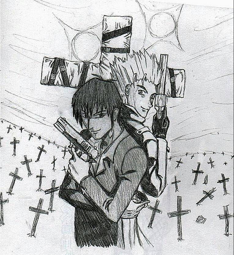
I like the repetition of shape (cross) and the fact that they are all at different angles on an un-even slope, which gives it a certain mood. Is the picture drawn at a slant or was it just folded over or something in the top right hand corner? You could just crop that top section off if you wanted to. Vash's hair looks cool, but I just realized it looked a little flat. You might want to put a little bit of shading at the base of it where it meets the head. Technically Wolfwood's hair has the same problem, but it isn't apparent because it is so dark and there isn't as much of a difference in the shading. You drew the longer strands darker so that helps too.<br />
<br />
It is pretty obvious that the light source(s) are behind them, but the shadows don't accurately portray that really. It looks like it is a flaw the original artist did as well, probably because he wanted to add both the suns in there and he didn't want to draw the two characters completely dark. I supposed there could be a third light source in front of Wolfwood and to his left that would make those lights, but normally if there is a sun (and especially if there is two!) then it(they) is (are) the dominant light source. But non-the-less the shading looks cool =)<br />
<br />
I'd say this is my favorite drawing of yours =) It would just be an average drawing for you (Which is still high quality =)) if it wasn't for the background (even though the foreground is drawn a lot better and I like it better). I know you hate doing those but they really are effective ;)