Username   Password  
Remember   Register   |   Forgot your password?

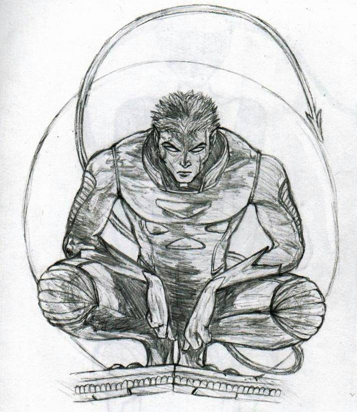
Nightcrawler with Moon in Background

Nightcrawler with Moon in Background

Nightcrawler with Moon in Background by BAMFManiac

Description

Description
BAMFManiac
yay it's kurt! i love this guy! umm this is from the cover of the 1st issue of the Nightcrawler miniseries.<br />
<br />
Please Comment!

General Info

General Info
Ratings
None

Category Comics » - Marvel Comics » X-Men
Date Submitted
Views 2451
Favorites... 4
Vote Score 0
Comments 11
Media Unspecified
Time Taken
Reference
Tags

Comments

Comments (11)

You are not authorized to comment here. Your must be registered and logged in to comment

MercWithAMouth on January 1, 2006, 2:18:34 PM

MercWithAMouth on
MercWithAMouthThat picture is my most favoritest of Nightcrawler. You drew it very well. I love this picture.

ladiedragon74 on June 7, 2004, 12:55:34 PM

ladiedragon74 on
ladiedragon74cool picture!

DeathBo on April 11, 2004, 5:25:11 PM

DeathBo on
DeathBoNC is so cool

BAMFManiac on March 3, 2004, 1:27:09 PM

BAMFManiac on
BAMFManiacit's from the cover of issue #1 of the nightcrawler miniseries, chris. lol i wish i could come up with cool stuff like that!

Boss_Man7089 on March 2, 2004, 9:43:25 PM

Boss_Man7089 on
Boss_Man7089Nice pic, did you get it from a pic or is that all your own idea?

Slash on February 24, 2004, 12:39:39 PM

Slash on
SlashWow, so much typing you two! The original is actually the backround on my pc. Nightcrawler rules, nice hair!

BAMFManiac on February 1, 2004, 11:09:47 AM

BAMFManiac on
BAMFManiacyea, i see what you mean about his head needing to be a little longer- i'll try adding more hair. oo you're rite about those shoulder lines- haha i didn't even see them before (they're pretty dark). hmm yea those will definitely help. <br />
<br />
and about his tail- i don't care if my drawing is exactly like the reference, lol i just think it looks better with his tail closer. thanks tho!!

Jyan on February 1, 2004, 8:59:52 AM

Jyan on
JyanThe other thing that would probably help is on his shoulders he has little lines going from the shoulder crease to his collar. Those help indicate where the top of his shoulders are. Without those (because of the angle) it is hard to tell where that is and the eye would generally want to place that point further up (making the shoulders look too bulky). Yea, I would try adding those two horizontal lines before I mess with the head at all because they would be easier to change/erase if they don't turn out that well.<br />
<br />
And the tail looks fine! Just because it isn't the same as the original doesn't mean it isn't correct. Unless you are trying to draw an exact duplicate which can get a little redundant. personally, I like the tail with a little more room. The comic book pages aren't the same size as normal paper. Because of this they probably had to squeeze his tail into there. I think, if they had the choice, they would have made the tail more like yours.

Jyan on February 1, 2004, 8:59:34 AM

Jyan on
JyanOk, I looked for the original pic and found it. I think the way they made that area look better was in their pic Kurt's head was the same width as yours but theirs was a little longer. The top of the head was stretched up a little more. I found that odd because normally comic book characters have smaller heads to exaggerate the size of their bodies (the smaller their head the bigger their bodies look). But likewise in this pic the bigger the head the smaller the shoulders would look. However you did a great job on the head and I would be hesitant at ruining it. If you do want to change it though just add a little more hair to the top (in order to make it not look odd don't just add hair to the top center, make sure you add a little to the sides as well and add more all the way up gradually more till you get to the top of the head... if that makes sense. Basically, if his head looks too pointy try adding hair to the sides of his head. In the original his head does kinda look box-shaped to me.)

BAMFManiac on January 31, 2004, 3:40:05 PM

BAMFManiac on
BAMFManiacaww thank you so much! hehe i'm a bit of an x-freak, and kurt is one of my favourite xmen characters too! he's mad hard to draw, tho!<br />
<br />
hmmm yea the neck/shoulder area does look rather odd, but if you see the original pic (it's rather popular- i've seen it on tons of nightcrawler sites), then it probly looks more natural.<br />
<br />
dude his hair was sooo hard to draw! the 1st couple times i tried, it looked like his head was on fire!<br />
<br />
ugh. i messed up the tail. i just noticed that. it should curve towards him more. o well... thanks again!!