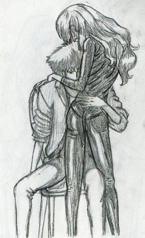
Spike and Julia
Spike and Julia
Spike and Julia by BAMFManiac

Description
Description
General Info
General Info
Comments
21
Media Unspecified
Time Taken
Reference
Media Unspecified
Time Taken
Reference
Comments
You are not authorized to comment here. Your must be registered and logged in to comment
Amai-wan on May 16, 2004, 12:40:19 PM
Amai-wan on
Myst on May 16, 2004, 2:17:37 AM
Myst on
DeathBo on April 11, 2004, 5:38:56 PM
DeathBo on
Jyan on March 9, 2004, 9:47:40 PM
Jyan on
BAMFManiac on March 9, 2004, 12:36:30 PM
BAMFManiac on
<br />
the basic thing with shading here is that the whole picture is very dark, so really his left arm and sleeve are very darkly shaded in the orginal, so you can't tell if it's darker by the elbow or not. i just shaded it in lightly b/c i wanted you to be able to see everything (so he wouldn't blend in w/ julia's black outfit). heh i didnt think about the shading inside the sleeve thing at the time tho. i'll have to fix that.
Jyan on March 8, 2004, 12:19:56 PM
Jyan on
The reason why I post less tips on the pics where you refer to another pic is because you do it so well that there is hardly anything to post on. Even on this pic where you verbalized your dislike for it I still don't have much to comment on. And when there are things to comment on I'm not sure if that was something that was wrong in the original pic (Like in "Vash and Wolfwood: A Team of Two"). I like the pics that you come up with better (I like them all though).<br />
<br />
For this the shading isn't that badly blended. Mostly it is on his pants, his shirt is just striped so that might be what is making it look off. His left hand seems like it is just floating there because of two things with shading (I don't know if it was in the original pic or not, but I still think it would help). The two things are, when you are looking inside someone's sleeve it is darker than on the outside, and, typically, when objects go away they become darker, even if they are in reality the same brightness. So his right arm would be darker at the elbow than at his wrist. That would help with the dimensions. I didn't even notice Julia's head till you mentioned it. It was probably just because the hair.
BAMFManiac on February 13, 2004, 6:06:44 AM
BAMFManiac on
Juli on February 4, 2004, 2:15:59 PM
Juli on
BAMFManiac on February 2, 2004, 1:57:24 PM
BAMFManiac on
blue_thunder on February 2, 2004, 1:00:57 PM
blue_thunder on
