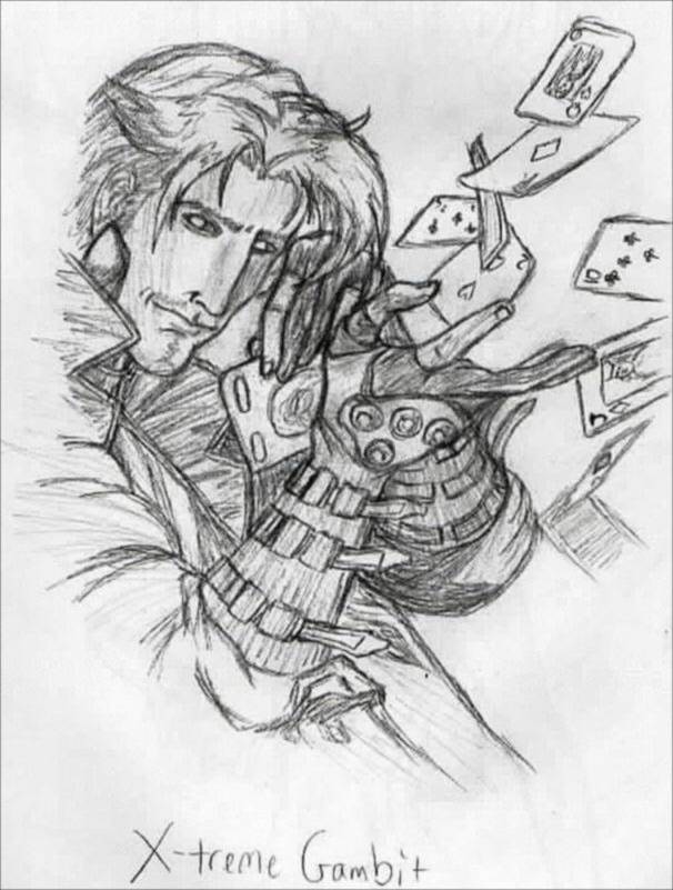
Gambit to the XTREME
Gambit to the XTREME
Gambit to the XTREME by BAMFManiac

Description
Description
General Info
General Info
Ratings
Category Comics » - Marvel Comics » X-Men
Date Submitted
Views 3051
Favorites... 6
Vote Score 0
Category Comics » - Marvel Comics » X-Men
Date Submitted
Views 3051
Favorites... 6
Vote Score 0
Comments
18
Media Unspecified
Time Taken
Reference
Media Unspecified
Time Taken
Reference
Comments
You are not authorized to comment here. Your must be registered and logged in to comment
Jyan on March 21, 2004, 9:24:55 AM
Jyan on
BAMFManiac on March 18, 2004, 4:35:07 PM
BAMFManiac on
<br />
lol it's ok jyan! yea the "I'm having a hard time finding what I like about this pic" did confuse me a bit b/c then you said it's all pretty good. heh i don't know why i didn't shade the cards (probably got lazy), but i think most of the shading is a little odd- not enough contrast, i think. thank you very much tho<br />
<br />
hahaha i love how people are always like "whoa that's such a long comment!" on like all of my pics. don't you feel special?
Jyan on March 16, 2004, 5:34:39 PM
Jyan on
<br />
And when I said "I'm having a hard time finding what I like about this pic" I meant what I liked best ;) *Sigh* I really should wait till I am awake more when I post!
DaBear on March 16, 2004, 8:36:19 AM
DaBear on
DaBear on March 16, 2004, 8:35:26 AM
DaBear on
WaterNeko_Goddess on March 14, 2004, 6:36:02 AM
Jyan on March 9, 2004, 10:20:13 PM
Jyan on
I have never seen this version of Gambit before, the pic is real cool =) Yea, you called the whole shading thing, although it doesn't really stand out. I think it would just make the pic better if you had it so every item was effected by shading. I know it is a lot of work but it just depends on how much detail you want to put in your pics (truth be told, you don't need perfect detail in all pics, a lot of pics actually look better with less detail). You have shading in almost all the items (other than the cards, which could prolly use it), but most of the items you have shading for could probably use some more contrast. It would especially help the face feel like there was more depth. I know the original prolly didn't have this mark, but you could toy with having a mark for the last joint in the pointer fingers. If it looks funny don't keep it, if you like it then leave it in there. I am having trouble thinking if it would look better or not and there are just as many opinions as there are viewers so it is up to you.<br />
<br />
I'm having a hard time finding what I like about this pic, it is all pretty good ;) There is plenty of motion, and more than one focus, the expression on his face keep interest, his hair has a nice form, there is nice detail in the gloves and armband things, the proportions of the cards, shapes, angles make it appear as if they have dimension which I have yet to do successfully with flying cards (harder than it looks!) and there is more than one plane to the pic. There is plenty to look at and I think you did a great job, like always =D
mewmagic5 on March 8, 2004, 11:42:32 PM
mewmagic5 on

<br />
Yea, sorry for the confusion in the post. I'm just glad I read it back over again so I could correct mysefl =D I wonder how many times I've done things like that on my posts to you... doh! Lol oh well, great pic =)