Username   Password  
Remember   Register   |   Forgot your password?

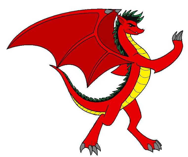
This is what a REAL American Dragon looks like

This is what a REAL American Dragon looks like

This is what a REAL American Dragon looks like by CatWhoHas14Tails

Description

Description
CatWhoHas14Tails
I was utterly disgusted with the new version of the American Dragon. So I showed them how he SHOULD have looked. ;D

Ok...so his tail is shorter than I wanted it to be...big deal. Just pretend its longer and more powerful-looking! XD

General Info

General Info
Ratings
None

Category Cartoons » American Dragon: Jake Long
Date Submitted
Views 3662
Favorites... 23
Vote Score 3
Comments 33
Media MS Paint
Time Taken
Reference

Comments

Comments (33)

You are not authorized to comment here. Your must be registered and logged in to comment

shewolf2118 on September 20, 2008, 10:59:39 AM

shewolf2118 on
shewolf2118awsome i agree he woz changed 4 the worst in the series

silent-insaneminako on May 15, 2008, 2:16:06 AM

silent-insaneminako on
silent-insaneminakoYup, totally agree with you. I like this design better!

KepzTheFairyChihuahua on April 3, 2008, 8:32:38 AM

KepzTheFairyChihuahua on
KepzTheFairyChihuahuacool, yes indeed, to bad, I mean te second seson was nice, but they REALLY meassed up with the desins, too I loved how Jake's gradnpa used to look, now it look like a lung with a serius malaria, or a dragon who ate a watermelon and then it was stucked on is head XD anyway ur vesion is nice

RayneOfDragons on August 21, 2007, 1:13:24 AM

RayneOfDragons on
RayneOfDragonsYes! This is how Jake was meant to look! Not skinny and all that crap. > <

simonemery3001 on June 4, 2007, 6:27:39 AM

simonemery3001 on
simonemery3001i like both seasons but mostly the second one

Dimondpelt on February 24, 2007, 3:47:59 AM

Dimondpelt on
DimondpeltWow that looks really good

mysticwolf on February 10, 2007, 3:42:14 AM

mysticwolf on
mysticwolfsince i dont watch disney anymore i had to go to the website and the new style looks...blegh, to pointy

Symphoniadancer on January 16, 2007, 1:51:02 AM

Symphoniadancer on
SymphoniadancerI hate the new version of AD JL, i find the lines too straight and random. I think that the only one who has got the same look as in the first season, it's the dog. But even though i don't like it, i still watch a bit.

For you work, i find it great. Your style of doing the head was the thing i liked the most. Great job!

Project_X on January 11, 2007, 1:55:01 AM

Project_X on
Project_XYeah jake looks pretty bad now. the only person that still looks mediocre is grandpa.
*faves*

GamerGirlGG on December 26, 2006, 2:18:00 PM

GamerGirlGG on

GamerGirlGGI agree, the new way of drawing them sucks big time! I wish you could've had this as the drawings! Jake just looks so...ugly in the new version. In yours he's awesome!