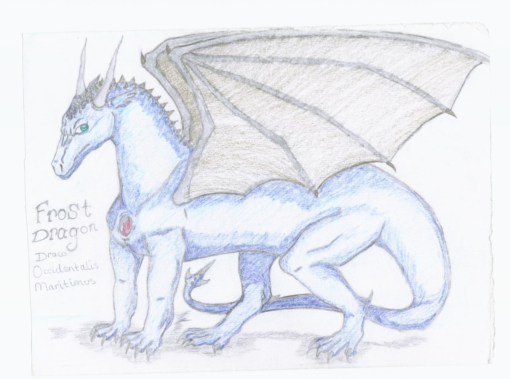
Frost Dragon
Frost Dragon
Frost Dragon by Frost_Dragon

Description
Description
General Info
General Info
Ratings
Category Fantasy » Dragons » Elemental Dragons » Ice/Snow Dragons
Date Submitted
Views 2550
Favorites... 9
Vote Score 0
Category Fantasy » Dragons » Elemental Dragons » Ice/Snow Dragons
Date Submitted
Views 2550
Favorites... 9
Vote Score 0
Comments
16
Media Unspecified
Time Taken
Reference
Media Unspecified
Time Taken
Reference
Comments
You are not authorized to comment here. Your must be registered and logged in to comment
Frost_Dragon on April 16, 2005, 8:34:06 PM
Frost_Dragon on
aqua_kitty on April 16, 2005, 8:30:34 PM
aqua_kitty on
Frost_Dragon on April 16, 2005, 8:22:21 PM
Frost_Dragon on
aqua_kitty on April 16, 2005, 8:20:00 PM
aqua_kitty on
dj_gamer_girl on April 4, 2005, 2:43:06 AM
Stratadrake on March 28, 2005, 8:05:07 AM
Stratadrake on
Personal opinions by me about this dragon are:
- The main 'arm' of the wings should probably have more muscle to it, to make them look stronger.
- How come the small ridge of spikes on his neck doesn't extend down his full spine?
- His back legs don't quite match up, proportion-wise. The far leg feels too far forwards to me, as if it wasn't built into the drawing's composition as well as the others.
- The colors are a little washed-out, too bright. If you look around on your scanner utility's menus, you should be able to find some exposure controls you can tweak to improve the tones & colors of the drawing when it's scanned. (Specifically, if you tweak the "midtones" value down slightly, the colors will look more vivid)
- Stellar job on the head and face, I like it. The neck feels about the right length by my standards, and although the tail seems a little thin, it seems about the right length too.
What else can I say? Nothing that a lot more practice and experimenting won't already improve upon, so that's it for now.
