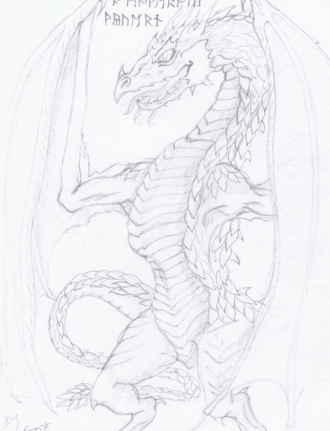
Wyvern Dragon
Wyvern Dragon
Wyvern Dragon by Frost_Dragon

Description
Description
General Info
General Info
Comments
15
Media Unspecified
Time Taken
Reference
Media Unspecified
Time Taken
Reference
Comments
You are not authorized to comment here. Your must be registered and logged in to comment
Frost_Dragon on April 4, 2005, 10:51:04 PM
Frost_Dragon on
ouija-phantom-wolf on April 4, 2005, 2:39:06 AM
Frost_Dragon on March 30, 2005, 6:15:18 PM
Frost_Dragon on
ilovebalmung on March 30, 2005, 7:46:17 AM
ilovebalmung on
Stratadrake on March 30, 2005, 1:27:21 AM
Stratadrake on
Although, the tail sort of bugs me. Then again, tails always bug me, I've never really liked the appearance of a tail going "out the back", "behind" the legs rather than between them... 'course that's just a personal taste issue, and nothing is going to change it.
The overall exposure of this drawing feels a little on the bright side, as well. If you haven't already, you should explore your scanner utility's menu system and locate its exposure/brightness controls sometime. I know pencil is a light medium compared to, say, paints or even colored pencil, but a little more contrast would really bring out some of the finer details in the drawing.
Even so, it looks great.

1. i do hav the dragonology book
2. i didn't say that it wasn't from the dragonology book
3. I didn't say that it was a completely oringinal pic that i thought up either
but thanxs 4 noticing the dragonology book is practically my bible!