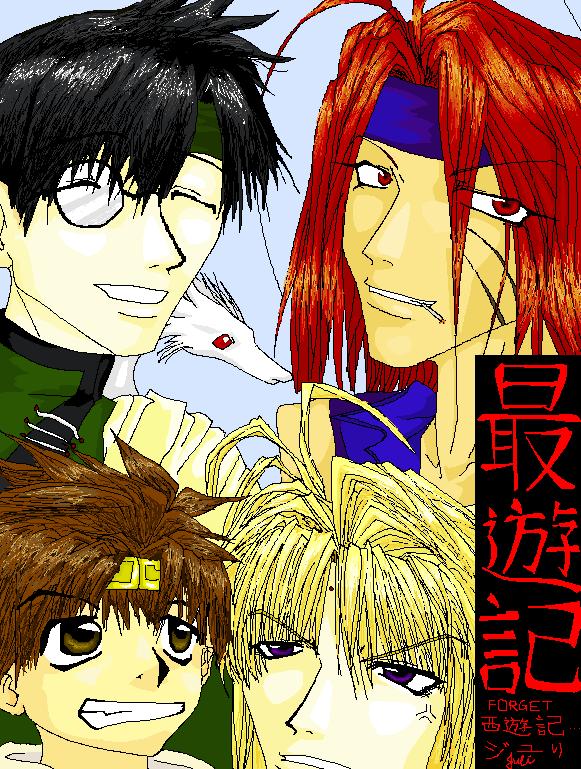
Sanzo-ikkou group portrait
Sanzo-ikkou group portrait by Juli
Description
Description
Yay, I finally finished it after procrastinating it for a bout a month or so.
This was done completely on MS Paint, the linework, the coloring, everything. I'm pretty happy with it except hakkais' hair looks terrible.
I am obsessed with Sanzo!!!!!!
Saiyuki is a great manga/anime, though I prefer the art style in the manga, its just so much more detailed.
This was done completely on MS Paint, the linework, the coloring, everything. I'm pretty happy with it except hakkais' hair looks terrible.
I am obsessed with Sanzo!!!!!!
Saiyuki is a great manga/anime, though I prefer the art style in the manga, its just so much more detailed.
General Info
General Info
Comments
12
Media Unspecified
Time Taken
Reference
Media Unspecified
Time Taken
Reference
Comments
You are not authorized to comment here. Your must be registered and logged in to comment
ladyofthecanyon on March 22, 2006, 9:11:23 AM
MS paint? Nice...
Metalbeast on January 1, 2006, 12:55:24 PM
Metalbeast on
Poison_Ivy on September 26, 2005, 11:25:59 AM
Poison_Ivy on
ray_lover100 on May 7, 2005, 12:16:23 AM
ray_lover100 on
DreamOfFire on January 21, 2005, 7:15:21 AM
DreamOfFire on
Meredianna on January 12, 2005, 1:15:09 AM
Meredianna on
Cara on January 4, 2005, 12:06:23 AM
Cara on
Caronee on January 3, 2005, 1:26:53 PM
Caronee on
Eh, I saved the best till last. Sorta. Anyways, his hair looks really time consuming. It's incredibly detailed and I think you took the longest time with Goku. His diadem's little too small though, and the color needs to be slightly more orangey, but good shiny effects. His eyes are the best part though. If you look at it, they almost look like liquid. Once again, I am amazed how how much you accomplished on MS paint!! His mouth is slightly too big. The overall comment? He's smaller in proportion than everyone one else. And the profile of the right side of his face is a little not right. It looks as if he has a little lump coming out of the right part of his chin, although that may be because you tried to draw him looking straight up. The saiyuki in red over on the right side is good, it's amazingly your writing, even though it's on ms Paint. ^^
Lovely picture and great shading.
Caronee on January 3, 2005, 1:21:42 PM
Caronee on
Sanzo's entire face isn't shown, but it seems that his face is slightly too broad. His hair is really really good, however, the antennae look as if they don't belong. They should have been placed a little more center. Good shading on his face and eyes! his eyes look really really good, and that exasperated expression is fun! One thing that pisses me off about the eyes is that the right one's lower than the left one. It just gives off an aura of unbalancedness (is there such a word? 0_o) but overall, Sanzo's really really good.
Caronee on January 3, 2005, 1:18:07 PM
Caronee on
Gojyo's hair was shaded beautifully, however, it's too short. His hair comes a little past his shoulders and you thinned it out too early. His shoulders look too skinny and closer, they need to be broader. But absolutely wonderful shading on him. I can't believe you did this with MS paint. GAh, the head band's shading is amazing. It looks muted on Adobe or something.