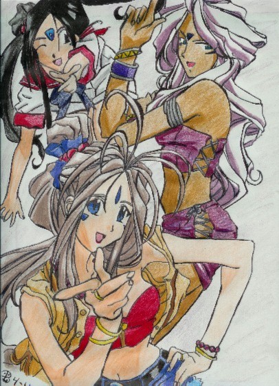
Belldandy and others!
Belldandy and others!
Belldandy and others! by foltzfarm

Description
Description
*heaves a big sigh* GRRR!! I HATE COLORING!!! >_< *takes in a big breath of air* allriighht.. *sigh* Well, I just finished this tonight. and sadly, I really don't think its all too grrreeaatt.. I mean, it's OK, but I kind of messed up.. MEEP! The piccy I was looking off of was from the internet^_^ I really don't know much about Ah! My goddess, except for Belldandy's name *laughs* The other two in the pic.. I really don't know about O.O I wish I did.. it looks like a nifty series!<br />
Well, anyways.. Pleez comment!! And please give out constructive critisism.. >_< I need it! ^_^Well, thanks for looking!
Well, anyways.. Pleez comment!! And please give out constructive critisism.. >_< I need it! ^_^Well, thanks for looking!
General Info
General Info
Comments
17
Media Unspecified
Time Taken
Reference
Media Unspecified
Time Taken
Reference
Comments
You are not authorized to comment here. Your must be registered and logged in to comment
Slippingthroughreality on April 19, 2005, 4:14:12 AM
foltzfarm on April 17, 2005, 11:18:11 AM
foltzfarm on
foltzfarm on April 15, 2005, 10:56:45 PM
foltzfarm on
neptuniumz on April 15, 2005, 2:58:29 PM
neptuniumz on
foltzfarm on April 11, 2005, 6:09:51 AM
foltzfarm on
ADDICT on April 10, 2005, 4:30:25 PM
ADDICT on
Anyway, the girl's elbow, the one on the lower page, seems to be a bit out. There's, something with the hands too, but otherwise, they seem fine. Her right shoulder seems kinda too long,the neck looks as if it's a bit out of place. It'snot align with the center. The right upper arm looks a bit narrow. The perspective with the girl on the upper left seems to be messed up. I couldn't understand her pose. Some of her right hand fingers are too short. There's something with the girl's elbows and/or arms,the one on the upper right. There's something with her abdomen (stomach) too.I suggest that you pratice body outlines more, they can really help out a lot, especially on perspective. Well,is that enough? I kinda like the way you do the hands though. I also love the shading. It's a really great pic! Just keep on practicing, and your work will become better!
