.:Don't Judge Me:.
.:Don't Judge Me:.
.:Don't Judge Me:. by misakicHii

Description
Description
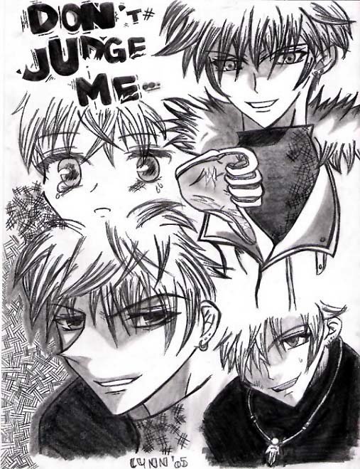
to start things off,this is a gift for sueno-y-muere!hope you like it!on my personal standards,i think it's bullshoot!i hate it!the top of lil haru looks like a girl and there's no backround added to it!it's so ugly!and the bottom right hand corner of haru looks like shoot!everything looks so rushed!!bleh!comments or say you hate it can be fine w/me
General Info
General Info
Ratings
Category Anime/Manga » Fruits Basket » Hatsuharu
Date Submitted
Views 2462
Favorites... 19
Vote Score 0
Category Anime/Manga » Fruits Basket » Hatsuharu
Date Submitted
Views 2462
Favorites... 19
Vote Score 0
Comments
14
Media Unspecified
Time Taken
Reference
Media Unspecified
Time Taken
Reference
Comments
You are not authorized to comment here. Your must be registered and logged in to comment
TheBloodstainedRose on October 2, 2009, 7:34:36 PM
NaomiSohma on August 11, 2006, 5:32:02 AM
NaomiSohma on
animeguys4me on April 6, 2006, 6:46:58 AM
animeguys4me on
Saru_no_Cheesecake on March 15, 2006, 11:23:50 AM
Metalbeast on February 26, 2006, 3:22:46 AM
Metalbeast on
InuYashaFreak818 on January 3, 2006, 8:57:41 AM
Mikagami on October 21, 2005, 6:36:33 PM
Mikagami on
I've done this kind of pic myself and I only included 3 heads. My point is, don't cramp a lot of stuff in one drawing cause that makes it look too busy. You can allways make another pic with the things you left out in the first drawing.
I hope my explanation makes clear what I wanted to say ( probably not but that's my fault XD )
And I hope these tips are usefull to you ^^
Keep up the great work
Mikagami
KittyTitan on August 6, 2005, 3:30:48 PM
KittyTitan on
Eshi on August 2, 2005, 2:39:19 AM
Eshi on
KittyTitan on August 1, 2005, 4:04:06 PM
KittyTitan on
